Weekly Design Digest: What’s New, What Matters, and What to Try
— Curated by a Design Veteran with 15 Years in the Trenches
Every week, the design world moves fast—from tool updates and UI trends to emerging practices and platform shifts. And if you're anything like me, you want the signal, not the noise.
That’s why I’ve started this Weekly Design Digest—a curated update of what’s worth your attention as a designer, developer, or product thinker.
Here’s everything that stood out this week:
🎯 1. Design Tool Update of the Week: Figma’s “Variables on Steroids”
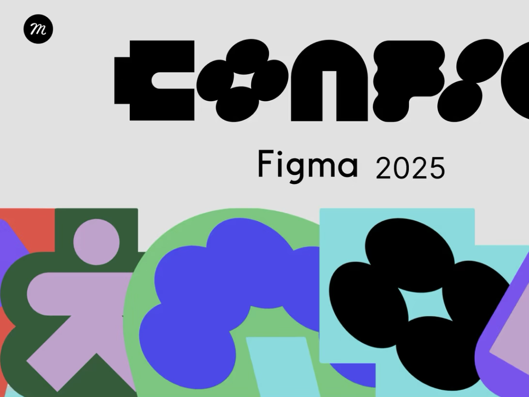
Figma just rolled out enhanced multi-mode variables—allowing tokens to respond to user actions and system-level changes like theme, accessibility, and device size.
Why this matters:
Design systems are now programmable and dynamic. You can apply different border radii, spacing, and even font styles per theme in a single click.
📌 Try this: Create a light and dark mode toggle prototype in under 3 minutes using the new tokens system.
💡 2. Microtrend Watch: Scroll Hijack is Back—but Smarter
A new wave of “scroll-driven storytelling” has emerged—think layered animations, responsive image zooms, and horizontal carousels on scroll. Done right, it feels immersive. Done poorly, it breaks UX.
Where it’s hot:
Agency portfolios
Creative SaaS sites
Startup landing pages
Inspiration: Check out getmedesign.com for crisp motion design that enhances, not distracts.
🧠 3. Insight from the Field: MVPs Need Identity—Not Just UX
Too many early-stage products launch without a visual soul. A solid MVP visual identity—even basic typography, logo, and tone—can build trust before your product even works flawlessly.
Read: How to Design a Visual Identity for Your MVP in Just 1 Hour
✍️ 4. Typeface of the Week: Satoshi
A clean, modern sans-serif that pairs beautifully with expressive serif fonts. Great for startups who want something between Helvetica and Inter.
Suggested Pairing:
Heading: Satoshi Bold
Body: DM Sans or Source Sans Pro
🎨 5. Color Combo of the Week: Lime & Charcoal
This combo is gaining ground in fintech, AI, and modern web apps. It brings a youthful spark (lime) grounded by dark neutral tones.
HEX Codes:
Lime: #D6FF00
Charcoal: #1E1E1E
Use it for: CTA buttons, landing page gradients, or subtle iconography.
🛠️ 6. Plugin You Should Try: “Design Lint Pro”
We’ve all been guilty of uneven spacing or off-token styles. This plugin scans your design file and flags inconsistent padding, wrong typography tokens, and hidden frame issues.
Download from the Figma Community. Your design QA team will thank you.
📱 7. Mobile UX Observation: Bottom Sheet > Modal
UX teams are increasingly moving toward bottom sheets instead of pop-up modals—especially on mobile. It feels more native, doesn’t block the full view, and allows layered interaction.
Where it works best:
Cart previews
Quick settings
Confirmation dialogs
📈 8. Quick Stat of the Week:
"93% of users say design is the #1 factor that influences their trust in a product."
(Source: Adobe x Forrester Study, 2025)
Your takeaway? Even with the right functionality, poor design kills traction.
👥 9. Freelance Tip of the Week:
Sell outcomes, not services. Clients don’t care about “5 screens in Figma.” They care about “designs that help convert 20% more users.” Align your pitch to impact, not process.
Need help creating a client-winning proposal?
📌 Use GetMeDesign — generate powerful proposals and portfolios in seconds.
🔄 10. What’s Coming Next Week:
Apple’s WWDC may drop new Human Interface Guidelines for visionOS
Adobe XD rumored to relaunch with AI tooling
Deep dive on design tokens in Webflow
🎁 TL;DR (Bookmark This)
Enjoyed this post?
✅ Follow for weekly design updates
🔗 Visit GetMeDesign.com to power up your portfolio
📩 Subscribe to get this as a weekly email digest
Let’s keep building smarter, faster, and more beautifully.