Why Designers Fail Even Before Opening Figma
Lessons from 15 Years on the Front Lines of Digital Product Design
By a Designer with 15 Years of Experience
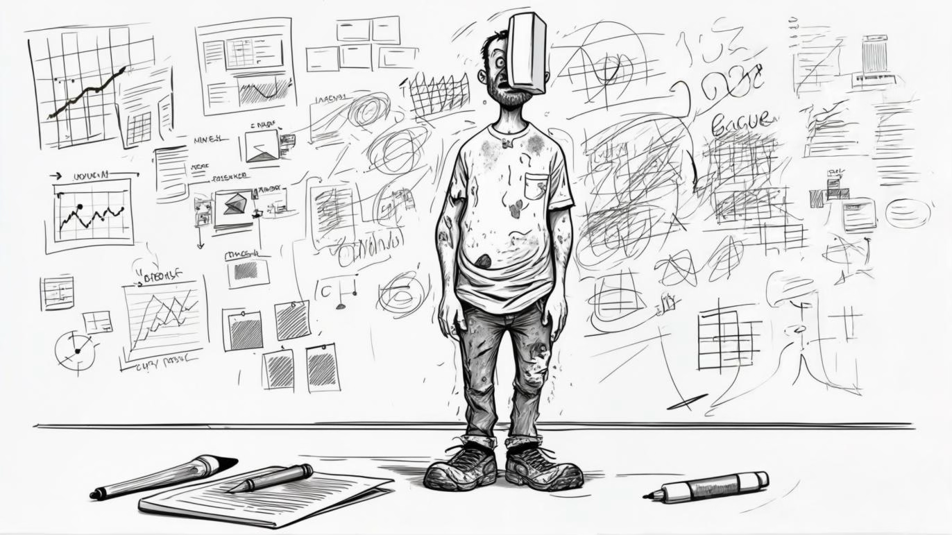
Figma is often the stage where ideas turn into delightful interfaces, but the truth is that many projects are already doomed before a single frame is drawn. After mentoring hundreds of designers and reviewing countless portfolios, I’ve noticed common—yet fixable—missteps that happen long before the design tool launches.
Below, I break down the most frequent reasons designers stumble in the pre-Figma phase and share field-tested tactics to set every project up for a win.
1. Skipping the “Why” and Jumping to the “How”
The pitfall
Designers eager to impress clients or stakeholders jump straight into layouts and color palettes without defining the problem they’re solving.
The fix
Write a one-sentence problem statement. If you can’t articulate it, you’re not ready to design.
Validate with stakeholders early. A five-minute alignment call saves five days of rework.
2. Designing Without User Context
The pitfall
Relying on assumptions or personal taste, designers craft “beautiful” screens that land flat with real users.
The fix
Create lean personas. Even a quick survey or three user interviews reveal pain points you’d never guess.
Map a micro-journey. Outline the before, during, and after of the user’s task to spot friction points.
3. Ignoring Business Goals
The pitfall
A UX that wows peers might still fail if it doesn’t move a key metric—sign-ups, conversions, or retention.
The fix
Ask for KPIs upfront. Clarify which metric the design must impact.
Tie every screen to ROI. If a component doesn’t push the metric, question its necessity.
4. Treating Design as a Solo Sport
The pitfall
Designers stay heads-down until the “big reveal,” only to discover engineering constraints or brand conflicts too late.
The fix
Run micro-crits. Share loose sketches with devs and PMs twice a week.
Document decisions. A simple Notion page prevents “Why did we do this?” debates down the road.
5. Neglecting Information Architecture (IA)
The pitfall
Jumping straight into hi-fi mocks without a sitemap results in disjointed flows and endless edge-case patches.
The fix
Sketch a quick IA tree. Even a white-board photo clarifies hierarchy.
Test the flow verbally. If you can’t explain navigation aloud, users won’t grasp it either.
6. Underestimating Technical Constraints
The pitfall
Designers propose animations or layouts that look spectacular but require exotic code, ballooning timelines and budgets.
The fix
Read the tech stack. Know the front-end framework’s strengths and limits.
Prototype in code when possible. Simple CodePen demos help gauge feasibility early.
7. Poor Time-boxing and Task Breakdown
The pitfall
Starting broadly—“design the dashboard”—without granular tasks leads to paralysis by analysis.
The fix
Break work into 90-minute sprints. Define deliverables for each sprint (e.g., wireframe widgets, copy draft).
Use a kanban board. Tools like GetMeDesign offer built-in task tracking so designers can visualize progress and stay accountable.
8. Forgetting Content Strategy
The pitfall
Leaving real text and data for “later” forces last-minute copy cram that ruins visual balance.
The fix
Draft key microcopy first. Headlines, CTAs, and error messages inform layout decisions.
Employ realistic content. Fewer lorem-ipsum surprises during hand-off.
9. Overlooking Accessibility from the Start
The pitfall
Designing color-driven UI or tiny typefaces that later fail WCAG checks—and need an overhaul.
The fix
Run a quick contrast test on color choices. Plenty of free tools exist.
Adopt an 8-pt grid and scalable typography. Accessibility baked in beats retrofits every time.
10. Failing to Define Success Criteria
The pitfall
When “good design” is subjective, feedback becomes chaotic and endless.
The fix
Set acceptance criteria. Example: “Users should complete checkout in under 2 minutes.”
Plan a usability test. Even five users can confirm success or flag issues before you polish pixels.
Final Thoughts
Great design begins long before the first rectangle is drawn in Figma. It’s forged in problem framing, user empathy, technical awareness, and strategic alignment. Master these pre-tool disciplines, and Figma becomes not a battleground but a playground.
Ready to level-up your workflow? Join the design-first community at GetMeDesign.com to access templates, task boards, and seasoned mentors who ensure you never stumble before the real work begins.